
I'm really happy with the way the banner turned out. I like that my blog and website finally feel like they're connected thematically. I like that the colors match my personal brand (such as it is) with my rainbow/unicorn/cotton candy/opalescent hair...what? You don't know about my hair?

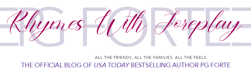
Here it is. See? It matches my website. The real question, of course, is does that match my AUTHOR brand.
And...I don't know the answer to that. It's something I've been struggling with for a lot of years.
What even is my author brand? I thought I'd come close a couple of times. My last tagline: "All the Friends. All the Families. All the Feels." said it pretty well. My books are ALL ABOUT friends, family, and feelings. But the tagline never really caught on. Maybe it was too trendy, or too on-the-nose.
"Once more with feeling," popped into my head last night as I was working on the banner and..I don't know. It seemed to fit. Maybe because I've been writing a lot of books in the Second Chance Romance trope category. I think about two-thirds of all my books qualify to some extent. It's a great trope! Absolutely one of my favorites. Also, one of the most common compliments I receive is about the emotion in my books. Or what some might call angst. It's odd, really, because what I want to write is RomComs and Cosy Mysteries. But what I end up producing is angst and tears. But, as a tagline, once more with feeling seems to works for me.
BUT there's more. See, that logo is not an accident, either. It doesn't really say PNR Author or Romance Author, or any kind of author. But I'm attached to it. It has history.

Many years ago, my husband was a fashion photographer in NYC. His first studio was on Avenue of the Americas between 38th and 39th streets--one block west of Lord and Taylor. Our neighbor was a graphic designer who used that exact font to create my husband's Forte Photography logo. And I later amended it to add three horizontal lines at the end.
See, forte--as a musical directive--means to play something loudly or with force (the opposite of piano). The first I Ching hexagram, Ch’ien, consists of two sets of three, unbroken, horizontal lines representing creative energy. It's also sometimes referred to as "the force" which struck me as being absolutely perfect.
We used that on all sorts of promo--posters, ads, business cards. T shirts. When we first moved to LA from NY, and were largely bi-coastal, we made up a bunch of promotional t-shirts that said either FORTE New York, or FORTE Los Angeles (White on black for NY, black on white for LA). That's my husband, back in the day, with our son (who's all grown up now!).
We used that on all sorts of promo--posters, ads, business cards. T shirts. When we first moved to LA from NY, and were largely bi-coastal, we made up a bunch of promotional t-shirts that said either FORTE New York, or FORTE Los Angeles (White on black for NY, black on white for LA). That's my husband, back in the day, with our son (who's all grown up now!).
When our son first moved back to Los Angeles from the Bay Area, we showed him pictures of them (like the one above) and he decided to adopt the logo as his own.
Here's his new shop:
Here's his new shop:

Pretty, no? He's a tattoo artist, in case you couldn't immediately tell. Just kidding, it's not obvious AT ALL, which is just the way he likes it.

Anyway, shortly after this, I was once again re-branding myself and it occurred to me that maybe I should...I dunno, show solidarity with the family brand? Take advantage of some of that I Ching, yang energy? Embrace "the force"?
And, since I was also using my first name--okay, first initials--rather than just our last name, I decided to add that second set of horizontal lines at the front.
So, there you have it. I'm recycling a logo I helped to create years ago to promote emotion-laden books. Or, in other words, Once. More. With. Feeling. It practically writes itself, doesn't it?
Something else that fits the tagline: the reboot of the Oberon series: coming soon! To read more about that, join my FB reader group The Crone's Nest, or check out my Other Blog (and my OTHER new header):

No comments:
Post a Comment